Introducing a Virtual Queue System to Elevate the Starbucks Experience
The Brand
Starbucks is an established international coffee chain that prides itself on providing a cosy and intimate space for people to relax, work or connect with friends. This is the well-known “Starbucks Experience”.
The brand leverages on its accessibility and convenience that customers appreciate, to achieve their market leader status. In this project, we wanted to take a look at how we can elevate the Starbucks experience to achieve both user and business goals.
Objective
As part of a UX immersive course, the objective of this project was to evaluate multiple user touchpoints with the aim to uncover areas of opportunities that we can conceptualise, design and validate upon.
Based on issues identified from user research, we zeroed in on two key touchpoints that will best allow us to solve the user frustrations - adding new features on the Starbucks mobile app and creating a brand new in-store kiosk.
Business Goals
We also wanted to ensure we were contributing to business goals with the following KPIs in mind:
💡 Increase usage of the Starbucks mobile app
💡 Elevate the Starbucks experience through excellent customer service
TIMELINE
2-weeks sprint
Aug-Sep 2021
TEAM
Clarissa Sung
Jeremy Lee
Sylvia Moh
MY ROLE
UX Designer & Researcher
DELIVERABLES
User research & persona
Heuristics evaluation report
Customer journey map
User flows
Sketches & wireframes
Interactive prototypes
Usability testing report
Service Design Test Plan
Style guide
TOOLS
Figma
Google Tools
The Solution
We designed a brand new queue feature on the existing Starbucks mobile app and improved dine-in outlet selection by adding in new crowd level indicators and making amenities filtering easier for Starbucks app users.
An in-store kiosk was conceptualised to support non-Starbucks app users or Starbucks app users who are already physically at the store.

01 | Virtual Queue on Mobile
Secure a seat with the new virtual queue on the Starbucks App at the touch of a finger.
02 | Outlet Crowd Level Indicator
Never run another fool’s errand with outlet crowd level indicators.


03 | Get Rewarded for Queuing
Enhanced queuing experience with surprise rewards for in-store redemption.
04 | In-store Queue Kiosk
Get a ticket at the in-store kiosk and be notified when seat is ready.

Design Process

Understanding the User & Context
CONTEXTUAL INQUIRY
At the onset of the project, we decided to head down to the most popular Starbucks outlet to establish a general understanding of Starbucks’ customers’ experience during peak period. This project was conducted during the COVID-19 pandemic with dine-in restrictions commonly implemented across cafes.
Queue to Dine-in >

Enter Store >

Queue to Order

USER INTERVIEWS & INSIGHTS
With a context of possible issues mind, we then set off to conduct user interviews with coffee and tea lovers between the ages of 18-35 year old to understand their motivations and frustrations behind discovering, selecting and purchasing coffee/ tea.
The insights were distilled into our persona - Caffeinated Carl, who we referenced throughout the design process to guide our design decisions.


CUSTOMER JOURNEY MAP
We synthesized the findings from user interview and contextual observation insights into a customer journey map that would be a most realistic scenario that Carl would take.
This bird’s eye view allowed us to identify 2 key touchpoints with the greatest user frustration - outlet selection and getting a seat for dine-in. The uncertainty around seat availability prior to dining in and drop-out at queue was causing a material impact on the business’ bottom line as users brought their business to other cafes.
USABILITY TEST & HEURISTIC EVALUATION
We wanted to find out how users would find a store, make payment and redeem their rewards on the Starbucks mobile app. We conducted a remote user testing of the current Starbucks mobile app.
Prior to usability testing, we also conducted a Heuristic Evaluation using Jakob Nielsen’s 10 Usability Heuristics to see early on if there were any potential usability issues, which helped inform us on areas to look out for during our usability test.
Design Goals
Based on the research we’ve done, we came up with and focused on 2 key HMW statements to reframe our key problems into open-ended questions that will allow us to brainstorm on ideas that target the identified issues:
01
How might we allow users to secure a dine-in seat with the least amount of time and effort?
02
How might we make it easier for users to make a more informed decision on selecting which outlet to dine-in?
Ideation & Feature Prioritisation
With the key issues in mind, we brainstormed and prioritised features based on their potential to positively impact our persona’s Starbucks experience while taking into account the level of resource required. We decided to focus on the ideas with the highest impact as highlighted in green below.

Addressing User & Business Goals
To address both user as well as business goals, we came up with a new virtual queue system. The aim is to help reduce perceived time spent in queue as well as allow the business adhere to safe distancing regulations while minimising drop-outs.
To reduce investment from starting from scratch, we plan to piggyback on the currently underutilised ‘Store Locator’ feature in the mobile app, which we will also be conducting improvements on.

New Starbucks Virtual Queue System
#1 HOW MIGHT WE ALLOW USERS TO SECURE A DINE-IN SEAT WITH THE LEAST AMOUNT OF TIME AND EFFORT?
ANYTIME, ANYWHERE
Using the mobile app, users can get a queue ticket at their convenience anytime, anywhere.
Securing a queue number beforehand diminishes users’ fear of not being able to get a seat upon arrival. The integration of the new crowd and queue length indicator with the queue system allows users to status check before joining a queue.
On the business front, the convenience of this feature is a unique selling point to boost mobile app usage. No other popular competitor cafes have this feature.


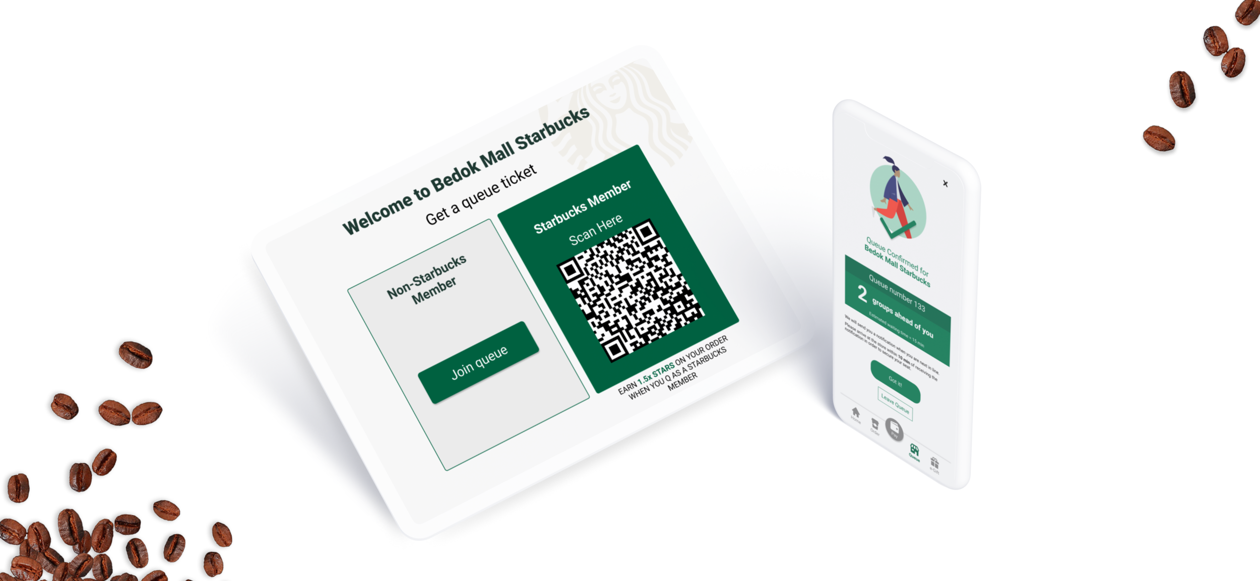
IN-STORE QUEUE KIOSK
The new in-store queue kiosk will be located at every Starbucks’ outlet storefront which allows users to seamlessly get a queue ticket without staff assistance. Estimated waiting times are shown for each respective group size so that users can make an informed decision on whether to join queue. Upon joining, the user will receive their queue number via text, with a second text notification following once their seats are ready.
The memory of the line can be enhanced both by adding positive experiences during the wait that can later be favorably remembered, but also by making the events at the line’s termination be incredibly positive and well worth the effort¹.
¹ Norman, Donald. (2010). Chapter 7. The design of waiting lines.
STARBUCKS REWARDS
In the conceptualisation of our queue system, we conducted comparative analysis on popular queue systems in the market - Genki Sushi and Ikea. While that formed the basis of our queue system, we were still concerned that there was nothing stopping users from leaving the virtual queue. Hence, we came up with a rewards system to incentivise and encourage users to stay in the queue.


Outlet Selection for Dine-In
#2 HOW MIGHT WE MAKE IT EASIER FOR USERS TO MAKE A MORE INFORMED DECISION ON DINE-IN OUTLET SELECTION?

Iteration & Validation
We conducted another round of usability test among coffee & tea lovers who have not used the Starbucks mobile app in the past month to validate whether the redesigns improved users’ experience and to uncover usability insights with the New Starbucks Queue System.
SYSTEM USABILITY SCALE (SUS) SCORE
The System Usability Scale (SUS) is a system usability assessment measured with 10 questions on a 5-point scale.
The mobile app redesign resulted in an marked uplift in usability results from ‘good’ to ‘excellent’.

EASE OF USAGE PERFORMANCE
The Single Ease Question (SEQ) is a 7-point rating scale to assess how easy users find a task.
The ease of usage also improved overall with the locating a store and getting queue ticket via the kiosk achieving full scores. However, there were still areas of opportunity, especially around seeking outlet amenities, which we further redesigned for future validation and iteration.

KEY HIGHLIGHTS

Users found the new crowd level indicators useful to determine which outlet they would visit

Search and map function were well integrated for users to search and view stores in a specific location

Mobile - Process to get queue ticket was easy and seamless (mobile)

In-store Kiosk - Process to get queue ticket was easy and seamless

Style Guide
We also created a style guide for the mobile application and queue kiosk to ensure visual consistency. On top of Starbucks’ established brand guidelines, we added UI patterns such as buttons and cards which frequently repeated across the various mobile app and kiosk screens with their respective usage guidelines.
Prototype
MOBILE PROTOTYPE
IN-STORE KIOSK PROTOTYPE
Next Steps
FURTHER ITERATION & VALIDATION
Based on users’ feedback, we iterated the mobile app again for further rounds of usability testing.
SERVICE DESIGN TEST PLAN
Due to social distancing limitations, the current sprint focused on testing interface usability as we were unable to test in-store experience with the new kiosk and mobile features. We drew up a Service Design Validation Test here for future testing, to validate whether the full user journey will improve.
REWARDS
Post-launch of the MVP of the in-app and kiosk queue system, we would like to implement the proposed scratch cards rewards. If proven to uplift metrics around queue drop-out rates and user satisfaction, we propose to explore other forms of activities and incentives as well to encourage users to adopt the queue system and boost the Starbucks experience.
Challenges & Key Takeaway
CONSTANTLY CHALLENGE ASSUMPTIONS
We initially thought that the process of queuing to order and pay would be the main bottleneck in the in-store experience. This proved to be wrong upon contextual observation. This goes to show that solid research and context behind behavior is always the foundation to designing relevant solutions.
TEAMWORK MAKES THE DREAM WORK
During ideation stage, all of us contributed towards potential features as well as all the knobs and dials of our wireframes. While it was a long process, I was really happy to find that our synergy created an end product that was greater than the sum of our individual efforts. It was a really fun and enjoyable experience!